304 pages of layout
105 photographs taken
42 individual resources designed
In response to rising xenophobia and the marginalisation of refugee children in South African schools, the Three2Six Education Project and Sacred Heart College sought to develop a resource that would help teachers engage with these issues in a meaningful, practical way.
The brief called for a resource that not only provided clear information and lesson structure but one that also challenged stereotypes, encouraged empathy, and placed real refugee stories at the centre.
Educators were struggling with how to address the refugee crisis in classrooms. There was a disconnect between the scale of the issue and the tools teachers had to respond to it, especially when dealing with younger learners. Refugees were often treated as statistics or abstract subjects rather than people with stories, families, dreams, and rights.
How do you design a learning resource that humanises an issue this complex, without overwhelming the classroom?
My role was to design a printed educational tool that felt both accessible and deeply human. I worked closely with educators and creative facilitators from the MindBurst Workshop, using real-world insights from the Three2Six learners themselves. Many of the stories, drawings and quotes in the resource were directly contributed by refugee children.
The challenge was to create a layout and tone that honoured the subject matter while staying flexible enough for teachers to use across various age groups.
The resource is broken into three clear phases (Intermediate, Senior, FET), with adaptable lesson plans and modular content. This gave teachers flexibility to integrate refugee topics across different subjects, not just Social Sciences or Life Orientation.
Instead of using stock images or generic icons, I took over 1000 photographs and incorporated original artwork created by refugee children. This not only grounded the material in authenticity but gave the learners a voice within the classroom. The photographs became central to the emotional tone of the piece.
At the heart of the design is a series of real storie, like “Julie’s Story” and “Fleeing Home”, which guide students through lived refugee experiences with empathy and context.
Typography and layout were carefully handled to avoid sensationalism while allowing space for reflection.
Six values underpin the document, like “We Are All Migrants” and “Difference is More”. These weren’t just chapter titles, they were visual anchors, repeated consistently through icons, colour palettes and tone. Each principle was supported by questions and activities to help students engage critically and personally.
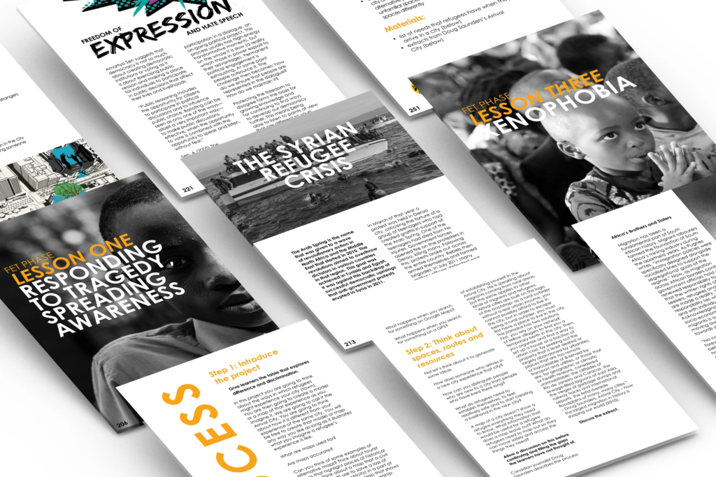
The final product is used in classrooms across South Africa and shared with educators at training sessions. It has sparked conversations, inspired creative responses from students, and offered a new lens through which to discuss migration, belonging and identity.
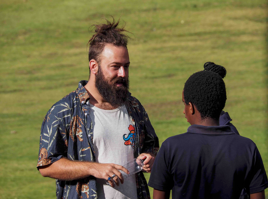
For refugee children who contributed, it was also a chance to be seen, not as victims, but as storytellers and contributors to their new communities.
This project wasn’t just about graphic design, it was about ethical design. The balance between educational clarity and emotional sensitivity was at the core of every layout decision. It taught me the power of using design to facilitate conversations that matter.
Most importantly, it reminded me that good design isn’t neutral and pretty, it chooses to stand for something.